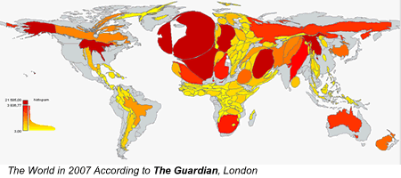
I was thrilled to get an email from Nicholas Kayser-Bril earlier today, introducing me to his research with Gilles Bruno on media attention. The pair are making lovely cartograms – maps distorted to show a particular factor – based on how much attention various media sources are paying to countries around the world.
The work has a good deal in common with my Global Attention Profiles research… except that the maps these gentlemen are making are quite beautiful, in constrast to mine, and their server isn’t dead half the time. I’m in the process of moving my scripts to a new server, and was delighted to discover that Google has put a brand new tool at my disposal – the ability to make complex maps based on passing parameters to a server. Google’s new Charts API lets you draw maps of the world, coloring nations based on the outputs of your scripts… which could lead to lots more cool tools that use world maps as a way of visualizing data.
I’m looking forward to Kayser-Bril and Bruno’s publications on the research. One conclusion that’s easy to draw based on their maps is the fact that every nation’s media is parochial. Australian newspapers focus heavily on Australia and New Zealand. Indian newspapers are obsessed with China and Pakistan. It would be interesting to study the interest clusters for each nation (what countries do Ghanaian reporters care about?) and to see whether there’s a baseline level of parochialism that we could compare countries to. Are Americans really more navel-gazing than the Swiss, for instance, as measured by their media attention?
Cool stuff – nice work, fellas.
Pingback: Mapping Media Attention at Resilience Science
Pingback: Green Design » Blog Archive » Media attention cartograms
Pingback: Davos Newbies » Blog Archive
Pingback: "The Internet Effect on News? | onLine haber,online bilgi
Pingback: The Numbers Guy : Why It's Hard to Map Media Coverage
Comments are closed.