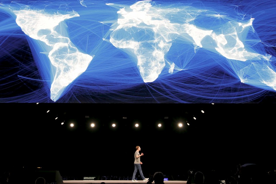
In December 2010, Paul Butler was a software engineering intern at Facebook, taking a break from his bachelor’s studies at the University of Waterloo, when he created a visualization that’s become core to Facebook’s mythos. Using a sample of friendships from Facebook’s vast database, Butler plotted great circle arcs connecting cities where friends had last logged into the service. What emerges from a sample of ten million relationships – college students in Boston connecting to high school friends in Michigan or Indian guest workers in the UAE sending messages home – is a glowing blue and white map of the world. In the US, India and Europe, the density of Facebook users is so intense that national borders and continent outlines are clearly visible, though the map has no geographic layer, just the geolocated representations of these ten million users.

Butler’s original image, December 2010
Mark Zuckerberg loves this map. Since 2013, it’s been the “cover photo” on his personal Facebook page, shared with his 97 million followers. (Prior to that: dog pictures.) On June 27, 2017, he posted an updated version of the image, with the message: “Updated with 2 billion people. The world is a little brighter now.”

The new Global Connections map, circa June 2017, author unknown
Butler was admirably clear about the methodology used to make his map. The unknown author of the new map – probably not Butler, as he left Facebook shortly after publishing his image – is unclear on whether this image visualizes all of Facebook’s 2 billion users (and their estimated 300 billion relationships) or samples a subset to construct the imagine. The issue is somewhat academic – as Butler explains in his text introducing the visualization, “Visualizing data is like photography. Instead of starting with a blank canvas, you manipulate the lens used to present the data from a certain angle.” Like photography, a visualization reduces the unfathomable complexity of reality to the contained complexity of a single, discrete image.
The angle Butler chose – and which Zuckerberg has celebrated – is the idea that Facebook can serve as a connective tissue for a global community. Butler explains,
“When I shared the image with others within Facebook, it resonated with many people. It’s not just a pretty picture, it’s a reaffirmation of the impact we have in connecting people, even across oceans and borders.”
Facebook has become a deeply important medium for allowing lightweight awareness and continued social connection between people who are physically separated. In the same way that Skype has allowed families to maintain strong ties over distance, Facebook allows you to maintain weak ties, the casual friendships you might otherwise lose when leaving your hometown. Butler’s map celebrates the persistence of these ties much in the way John Clang’s “Being Together” series creates family portraits that unite the present and distant by projecting absent loved ones into the living room via Skype and a portable video projector.

Image by John Clang, “Father”
The angle Butler chose – the focus on connection – is one that both reveals and distorts. While Facebook mediates billions of connections that span oceans and borders, those connections are vastly outnumbered by the local connections mediated by the platform. Fascinated by Butler’s visualization, I worked with Johan Ugander, a visiting researcher from Cornell embedded at Facebook, to understand the nature of these international connections on the platform. Queries Ugander ran suggest that roughly 12% of connections on Facebook cross national borders. (An earlier study suggested that 16% of connections were international, but likely miscalculated US/Canada connections.)
Ugander pointed out that these ties are not necessarily between a Canadian and an Indian – they are often between an Indian living in Toronto and the friends she left behind in Bangalore. Butler’s picture is a visualization of labor mobility as much as it is a picture of international connection. In our analysis, Ugander and I found a correlation between international Facebook ties and countries that either import or export labor. Those glowing lines on the map represent Filipina maids in Saudia Arabia and Pakistani construction workers in UAE staying in touch with the families and friends they’ve left behind.
Lost beneath the arcs is the reality that at least 7/8ths of Facebook’s connections are within the same nation, and that many, if not most, are yet more local.The bright white lights that outline cities and continents are the tiny, dense arcs between New Yorkers and Bostonians, or those in Brooklyn with neighbors in Queens. While the internet in general, and Facebook in particular, have made it potentially possible to connect with virtually anyone in any distant corner of the globe, digital tools may be more powerful for reinforcing local connections than building distant ones. Facebook welcomes us into its service by asking us about our past – our place of birth, our elementary and high schools, our colleges and jobs. For the 50% of Americans who live within 18 miles of their mothers, Facebook is more tool that deeply anchors us into our communities than connects us to distant ones.
When Zuckerberg appears in front of Paul Butler’s map, as he did at the Mobile World Conference in Barcelona in February 2016, it is unlikely that we think of strengthened local ties. Instead it evokes King Edward, standing before a massive Mercator projection of the world, a quarter of it painted in pink.
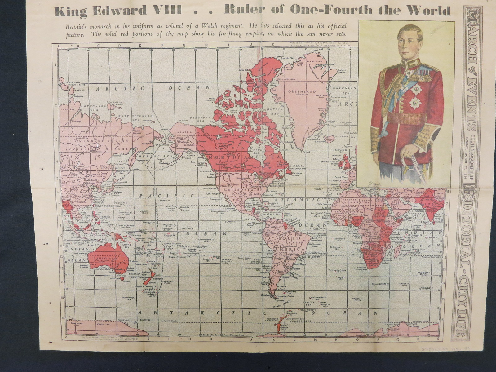
Benedict Anderson, in Imagined Communities, reminds us that a nation or an empire is a difficult concept to wrap our minds around. How can our brains, evolutionarily configured for life in groups of under 300, understand the idea of common identity with and responsibility to millions of strangers? Anderson posits that we rely on shared media – the image of the nation’s flag, the representation of Empire’s outlines on a map, the front page of a nation’s newspaper of record – to imagine the others saluting the flag and perusing the news.
Butler’s map invites us to imagine a global community, united by Facebook, the central idea of Zuckerberg’s February 2017 manifesto: “In times like these, the most important thing we at Facebook can do is develop the social infrastructure to give people the power to build a global community that works for all of us.” This infrastructure, he promises, is starting to provide us with emotional support, safety and civic information. We are being brought together for a purpose – “The purpose of any community is to bring people together to do things we couldn’t do on our own” – and Facebook asks us to become part of a community that is “spreading prosperity and freedom, promoting peace and understanding, lifting people out of poverty, and accelerating science.” We are the verge of a great change, “close to taking our next step” in human evolution, which has brought us from tribes to cities and now, on the verge of a global consciousness.
It is reasonable to react to Zuckerberg’s manifesto with sarcasm, cynicism or shock. Companies often use the language of membership or of family to indicate the relationships they want to have with their customers, but Zuckerberg’s pivot to the language appropriate to citizenship feels both audacious and terrifying. Can Zuckerberg believe we are willing to unite through Facebook into a global community, presumably under his benevolent leadership? Does Zuckerberg believe – as the manifesto suggests – that we are already starting to become this community? And could he be right?
Before we salute the Thumbs Up flag and seek out our place on our global community’s glowing blue and white map, it’s worth looking at maps that are aspirational, rather than wholly real. When immigrants came to the United States in the late 19th and early 20th century (a period when global mobility was much higher than it is today), they were met on the docks by land agents who spoke the languages: Norwegian, Polish, Italian, German. The land agents profited by selling off tracts of land in Minnesota or North Dakota, and their sales pitch centered on railroad maps, showing the tracks snaking west past orderly rows of towns with familiar names: Berlin, Hamburg, Frankfurt, Dresden.
Migrants would disembark from the train in Belgrade, Nebraska with hopes of a new home in a thriving Serbian community and discover a single house in town, built by the railroads to anchor the new town they hoped would spring up on the plains. The railroads financed their development through real estate sales – through an agreement with the US government, they owned half the land that bordered the tracks they built, while the government owned the other half. Selling land to new immigrants – who’d be dependent on the railroads for their connection to the rest of the world, and for any chance to return home – was a way of turning investment in infrastructure into fiscal return.
19th century railroad barons legitimately believed they were building a great nation and taming a wilderness at the same time as westward expansion made their fortunes. The maps of rail lines through the imagined citizens of the west were a complex mix of reality, aspiration and fraud. It is similarly possible that Zuckerberg and those closest to him believe both that they are making the world a better place through increasing connectivity and connection, and understand that they’ve cornered the global advertising market by inviting users to contribute reams of ad targeting information with every update they post.
If the bright arcs of Butler’s map are what capture our imagination, it’s the dark spots that demand our attention. Features missing from a map – terra incognita – can be as revealing as those present.

In 2003, NASA released a composite image of the earth at night, pieced together from dozens of satellite images taken between 1994 and 1995 on nights with little moonlight. While cities in North America, Europe and Japan are clearly visible, the most striking aspect of the images are the vast swaths that are dark at night, indicating either areas that are unsettled or – especially in Africa and Asia – settled, but not electrified. NASA updates the map regularly, but the overall pattern persists – a surprising percentage of the world has only limited access to the electrical grid, enough to power smart phones, but not enough to keep cities lit up at night. For champions of the global internet, the NASA image is a stark reminder that the world isn’t yet attached to high speed broadband, or even the electrical networks that would make such connections regular and reliable.
The dark spots on Butler’s map partially correspond with NASA’s map – Central Australia is dark on both because it’s so sparsely populated, while Congo is dark on both due to lack of infrastructure. But the spots dark only on Facebook’s map are ones where Facebook has been uniquely unable to penetrate: China, where the service is largely banned, and Russia, where the network is vastly less popular than competitors like ОдноклаÑÑники (Odnoklassniki/Classmates) or ВКонтаÌкте (VKontakte).
It’s difficult to speculate on the ambitions of a man like Zuckerberg, who’s achieved more wealth and power at a very young age than all but a handful of people. Does he want to be President? The world’s wealthiest man? I like to think that his ambition is to fully color in this map.
Zuckerberg’s celebrated efforts to learn Mandarin and to deliver speeches in the language suggest a depth of commitment to bringing Facebook to China that extends beyond the ambitions of most CEOs hoping to open a Chinese market for their products. Despite the network being blocked by the Great Firewall – and an uphill battle for market share against 微信网页版/Weixin even if it were accessible – Facebook has opened offices and hired developers in China. Contrast that with Google, who closed their Chinese office in 2010 over fears of censorship, and have remained out of the country, despite constant rumors they would re-enter.
Facebook’s efforts to reach other dark spots is at least as ambitious, and as controversial. In 2013, Zuckerberg published a white paper titled “Is Connectivity a Human Right?”, the header image of which was – as you might have guessed – the Butler map. His paper concludes that it’s economically imperative for everyone in the world to have access to the internet as we are undergoing a global shift into a knowledge economy that the developing world cannot afford to miss out on. Facebook’s response was Internet.org, an ambitious project to bring limited internet connectivity to developing world users which was partially rebranded Free Basics when activists (including this author) complained that the project didn’t give access to all the internet, and had to be understood as a marketing effort, not a traditional nonprofit.
Free Basics attacks the high cost of cellular network data packages as the cause of dark spots on the Butler map. Though more than 40% of the world’s 5 billion cellphone users now have smartphones, many people cannot afford data plans associated with these phones. Facebook has partnered with mobile phone operators in several developing world markets to offer access to a limited set of websites – including Wikipedia, local job-finding services and always Facebook – for free. As Zuckerberg put it in an op-ed for The Times of India: “Who could possibly be against this?”
One answer: Indian telecoms regulators, who saw the service as violating net neutrality, in providing connectivity only to a limited subset of content providers, rather than unfettered access to the entire Web. The heads of internet rights organizations in 31 countries signed an open letter – on Facebook, of course – to Zuckerberg, protesting the ways internet.org undermined the public internet in their countries. Connecting the dark spots on the map of Facebook users is likely to require diplomatic feats at least as complicated than learning Mandarin.
Zuckerberg is being led astray by his own map. The most challenging problems Facebook faces are not those of ensuring that all humanity is connected. The challenge is to manage the connections we already have. Facebook’s tendency to connect us most tightly with those who share our perspectives and views is part of the web of forces leading to polarization and the breakdown of civility in politics in the US and elsewhere. The tendency to pay attention to the struggles and difficulties of our friends distances us from struggles in other communities, even as networks make it more possible for us to connect with those directly effected. Before we take the next step in human evolution, we need to look closely at the downsides of the connectivity we’ve already achieved.
The nation of Myanmar, governed by a repressive military junta, remained offline for at least a decade after most of its neighbors. When restrictions loosened and Myanmar began coming online, Facebook was the service that captured popular attention. Myanmar missed the period where companies would write their URLs on the side of buses – in 2015, buses in Yangon advertised the keywords you should search on Facebook to find a company’s online presence. As Burmese people have come online, they’ve moved one of the world’s ugliest political debates – questions of whether Rohingya people should be Myanmar citizens – into an online space. The wave of violence the state has unleashed against the Rohingya, forcing as many as 900,000 to flee the country, often after experiencing rape, arson and violent attacks, has been supported and cheered on by millions of Burmese Facebook users. Kevin Roose, in the New York Times, argues that doctored photos and other misinformation shared on Facebook has empowered the military to act agains the Rohingya with impunity.
When Rohingya refugees arrive in Bangladesh, they charge their phones, log on and tell family and friends left behind that they’ve arrived. Each of those messages is a new white arc on Zuckerberg’s map, a connection between distant friends, a reminder that connection is rarely as simple we hope it to be.